
Navigating White Space for Better PowerPoint Slides
“White [space] is not a mere absence of color; it is a shining and affirmative thing, as fierce as red, as definite as black.”
Presentation slides are incomplete on their own, they require you, the presenter, to guide your audience through the experience you are facilitating. Developing the confidence to ensure the audience is focused on your message is part of the process of developing your skills as a presenter.
One way to do this is through white space, (also called negative space), the unmarked, empty area between different elements on a slide. White space doesn't have to be white; it can be any color, texture, pattern, or even a background image, as long as it serves the purpose of creating breathing room to separate visual elements.
In PowerPoint design, white space is more than just an aesthetic choice; it's a powerful tool for effective communication.
Proper use of white space can:
Improve Readability: Between lines of text, bullet points, and other elements makes it easier for the audience to read and digest the content.
Enhance Focus: Strategically positioned white space guides the viewer's attention to important elements, such as a call-to-action or key data points.
Create Balance: It helps in balancing out other design elements, making the slide look more harmonious.
Facilitate Understanding: Generous white space can help break down complex information into digestible chunks, making it easier to understand.
Convey Sophistication and Luxury: Many high-end brands use ample white space in their design to convey a sense of luxury and sophistication.
Best Practices for Utilizing White Space
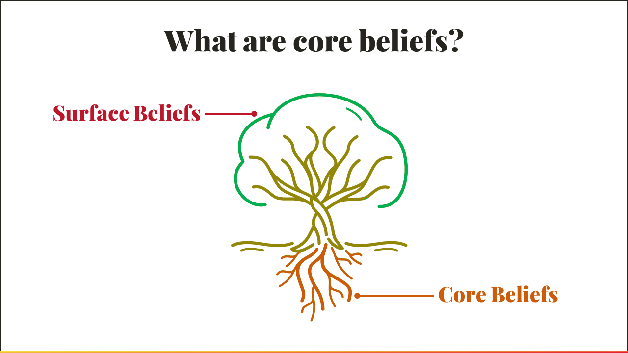
In the below Before | After example white space was created by splitting the core messages into two slides.
This technique works extremely well for processes that include multiple steps or diagrams that involve numerous components. Instead of packing it all into one slide, spreading design elements across multiple slides creates cohesiveness and helps your audience to process your message.

Before
After 1 of 2
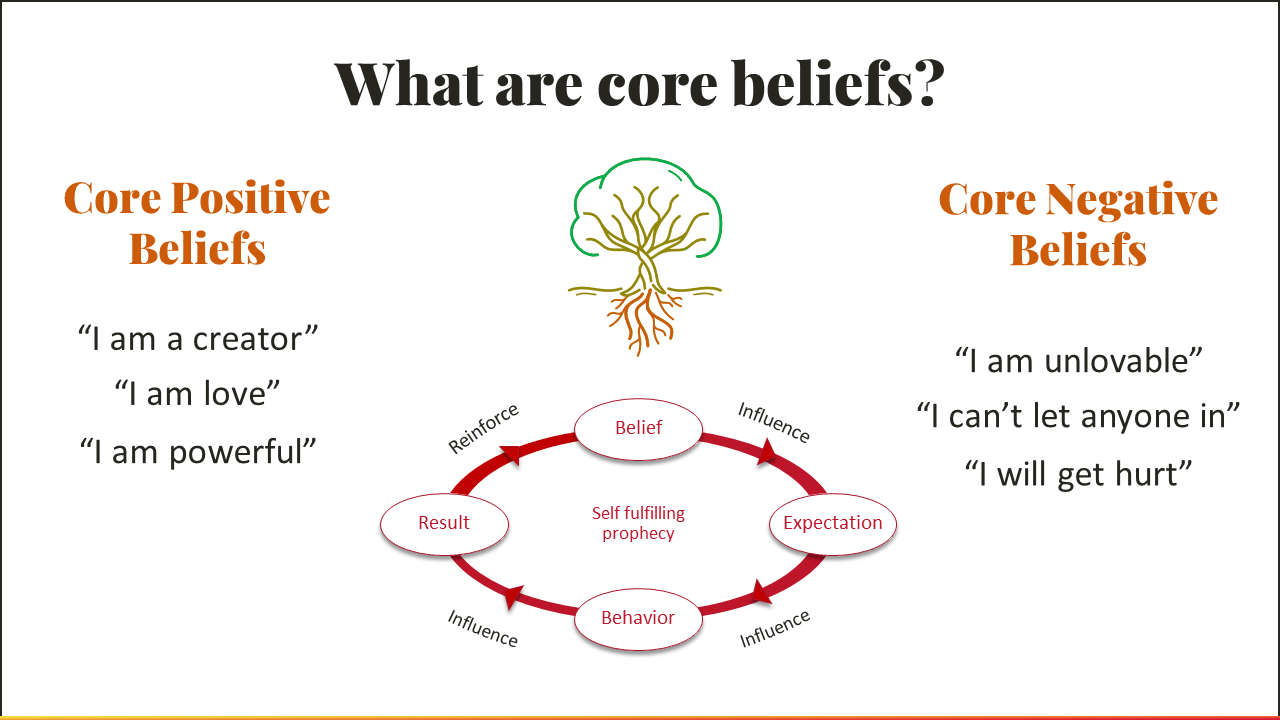
After 2 of 2
Take a look at each of the slides below. Notice where the eye is naturally drawn. Readability and focus are two very important reasons to include more negative space on your slides. What remains is what your audience will see.

Do's and Don'ts
Do’s
Do Use Margins: Allocate space around the edge of the slide to separate content from the edge.
Do Align Elements: Consistent alignment creates a natural flow and utilizes white space effectively.
Do Group Related Items: Put related text or graphics close together, using white space to differentiate them from other groups of elements.
Do Be Consistent: Keep the use of white space consistent across all slides for a cohesive look.
Don’ts
Don't Fear Empty Spaces: An empty area isn't necessarily "wasted" space—it can serve to highlight important content.
Don't Clutter: Avoid the urge to fill every empty area with text or images. Less is often more.
Don't Neglect Vertical Space: White space is not just horizontal—be mindful of spacing elements vertically as well.
Don't Forget to Test: Always review your slides on different screens to ensure the white space looks balanced.
White space is an active element that helps to refine design and improve message clarity. Like the artist Kenya Hara suggests, it's as "fierce as red, as definite as black" when used effectively. The next time you're working on a presentation, remember what you leave out is just as important as what you put in.
