Mastering Image Placement: Elevate Your Slides with the Rule of Thirds
Have you ever spent hours putting presentation slides together only to be disappointed with the result?
You’re not alone.
Despite the abundance of high-quality stock images available, a lot of people still find it challenging to create slides that look professional. The issue often isn't with the photographs, but rather their placement on the slide.
This journey Beyond the Deck begins with image placement.
The Rule of Thirds: A Primer

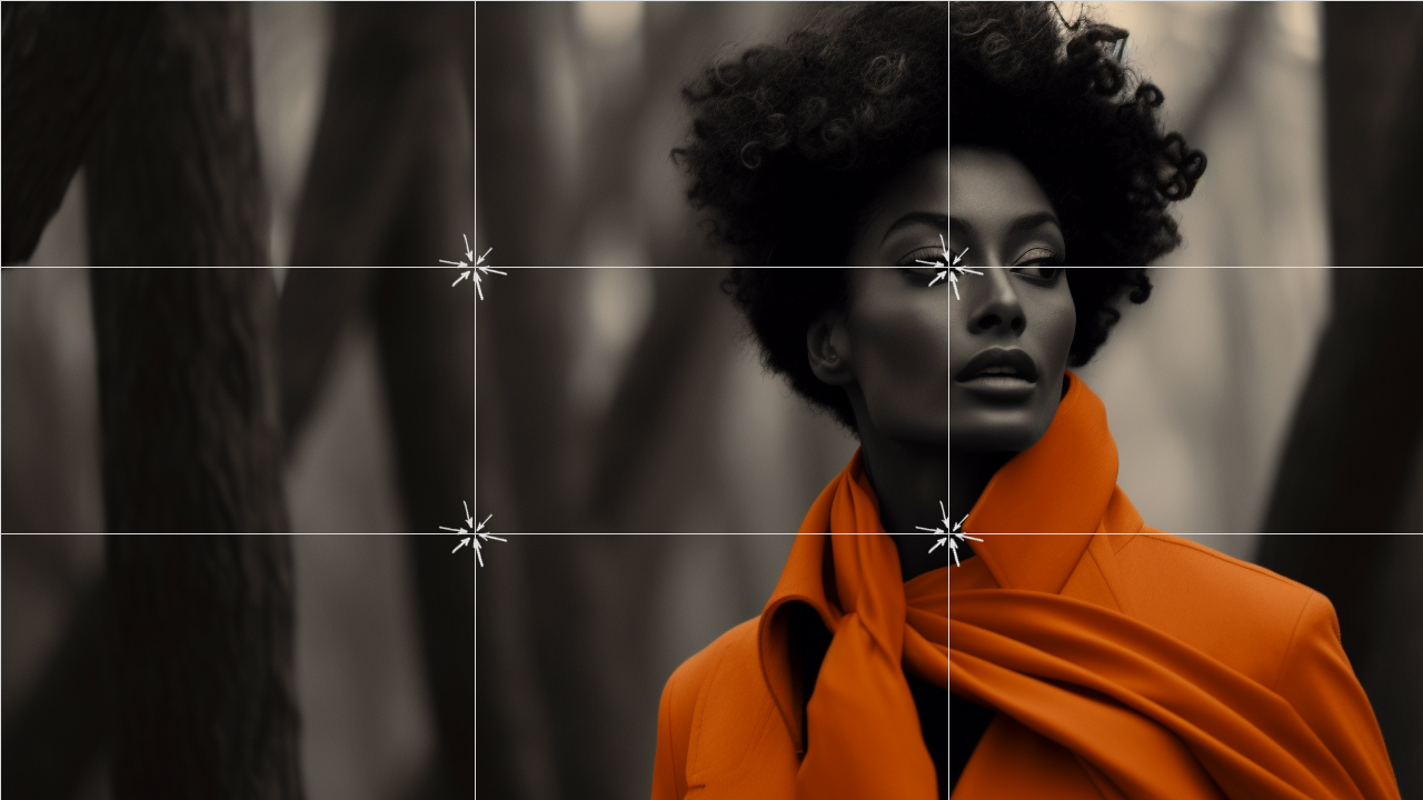
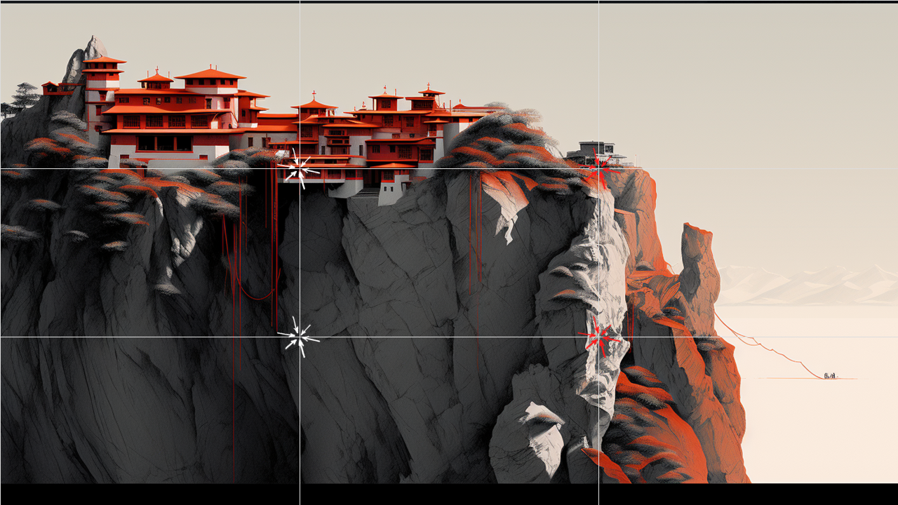


The cornerstone of effective image placement is a principle from visual arts called the "Rule of Thirds."
Here's how it works: imagine a 3x3 grid overlaying your slide. Your goal is to position the focal point of your image along these grid lines or at their intersections, which interestingly enough, are called "power points."
For example:
# A landscape horizon would align with the lower or upper horizontal grid line.
# The eyes in a portrait are placed with one of the top intersections.
# A product you're showcasing should align with one of the vertical grid lines.
Why It Works
Following this principle shifts your image slightly off-center, creating a more balanced look and allowing your audience to interact more organically with your content. If your image spills over the slide's boundaries, you can easily crop it using PowerPoint’s built-in cropping tool.
📌 PP Tip: To proportionally resize your image, hold down the <Shift> key while dragging the corner handle of the photo. This works for shapes too!
The Power of PowerPoint Guides
Before moving to the practicalities, let's touch upon an underutilized tool that can help you implement the Rule of Thirds: PowerPoint's "Guides." These non-printing lines act as on-screen rulers, aiding you in aligning text, images, and other elements. They offer a quick and efficient way to apply design principles like the Rule of Thirds, ensuring that your slides are not just beautiful, but consistently so.
Adding Visual Guides in PowerPoint
Here’s how to set up your guides:
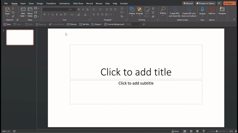
Navigate to Slide Master: View ➙ Slide Master
Right-click on the Slide Master
Select 'Grid and Guides'
Add two vertical guides at the 2.21” points
Add two horizontal guides at the 1.25” points
Case Study: Rule of Thirds in Action
The next time you leaf through a magazine or browse stock images, consider the transformative impact of the Rule of Thirds. Observe how this simple yet powerful design principle creates visual energy and directs focus to the points that truly matter.